Project Overview
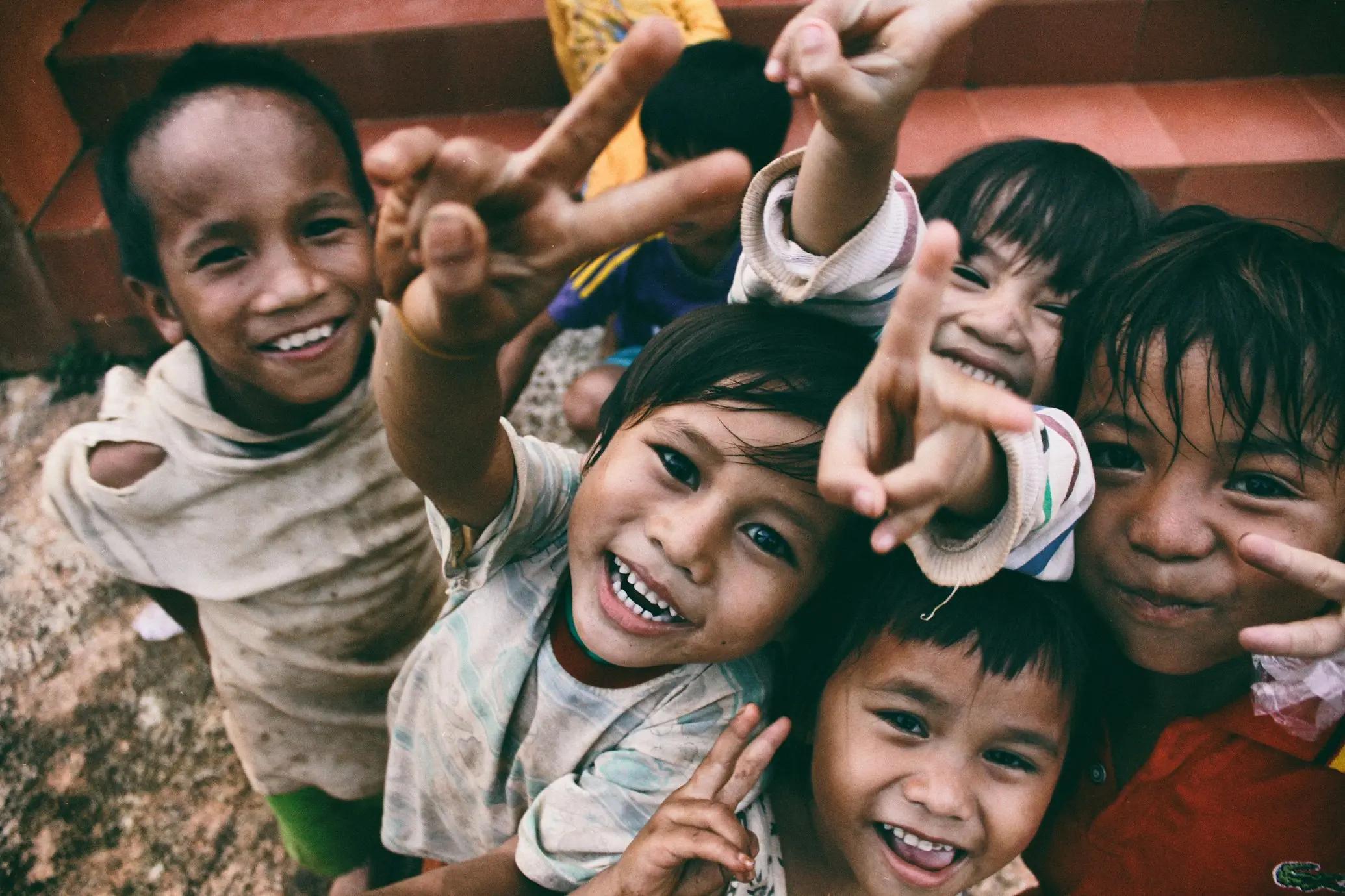
FOLTIN Foundation is a modern nonprofit platform created to communicate humanitarian initiatives, social impact programs, and community outreach efforts through a visually compelling and emotionally engaging digital experience.
The objective was to design a platform that felt:
- Trustworthy
- Human-centered
- Modern
- Accessible
- Emotionally impactful
while remaining scalable for future organizational growth.
The project focused heavily on:
- Storytelling-driven UX
- Brand credibility
- Mobile accessibility
- Modern frontend engineering
- Community engagement optimization
The Problem
Many nonprofit organizations struggle to create digital experiences capable of emotionally connecting with users while still communicating operational credibility.
Common issues across nonprofit platforms include:
- Weak storytelling systems
- Generic layouts
- Poor mobile responsiveness
- Confusing information architecture
- Limited engagement pathways
- Outdated visual branding
FOLTIN Foundation required a platform that could:
- Inspire confidence.
- Clearly communicate impact.
- Encourage donations and participation.
- Simplify program discovery.
- Position the organization as a modern humanitarian foundation.
Research & Discovery
User Research
Research showed that nonprofit audiences prioritize:
- Transparency
- Emotional connection
- Proof of impact
- Ease of participation
- Organizational trust
- Clear mission communication
Visitors needed quick answers to:
- What does the foundation do?
- Who benefits from the programs?
- How can people help?
- How is impact being created?
Competitive Analysis
Many nonprofit websites lacked:
- Emotional storytelling
- Strong visual hierarchy
- Modern UI systems
- Clear engagement flows
- Performance optimization
This created an opportunity to differentiate through:
- Modern humanitarian branding
- Premium UI design
- Better content structure
- Stronger storytelling systems
- Faster digital experiences
Design Strategy
Human-Centered Design System
The visual language was inspired by:
- Modern nonprofit organizations
- Humanitarian storytelling platforms
- Editorial design systems
- Contemporary SaaS-inspired layouts
The goal was to create an experience that felt:
- Compassionate
- Clean
- Trustworthy
- Hopeful
- Professional
Typography & Content Hierarchy
Large typography and structured spacing were used to:
- Improve readability
- Highlight impact messaging
- Guide emotional engagement
- Simplify content consumption
The hierarchy emphasized:
- Mission statements
- Community stories
- Calls to action
- Program highlights
- Donation pathways
Color & Visual System
The visual identity focused on:
- Warm tones
- Balanced contrast
- Soft visual energy
- Accessible readability
- Emotional warmth
Accent colors were used strategically for:
- CTA sections
- Volunteer actions
- Donation prompts
- Program highlights
UX Architecture
Simplified Navigation
The navigation structure prioritized:
- About the foundation
- Programs & initiatives
- Community impact
- Volunteer opportunities
- Contact & support pathways
The architecture was intentionally simplified to reduce friction.
Conversion & Engagement Optimization
The experience was designed to encourage:
- Donations
- Community participation
- Volunteer engagement
- Program awareness
This was achieved through:
- Repeated CTA placement
- Storytelling-driven sections
- Impact-focused layouts
- Simplified contact pathways
Mobile-First Accessibility
The platform was heavily optimized for mobile users through:
- Responsive typography
- Adaptive layouts
- Touch-friendly interactions
- Optimized image rendering
- Accessible navigation systems
Frontend Engineering
Technology Stack
The platform leveraged modern frontend technologies including:
- Next.js
- React
- Component-driven architecture
- Responsive design systems
- Modern deployment infrastructure
Performance Optimization
Performance strategies included:
- Image optimization
- Lazy loading
- Efficient rendering systems
- Optimized bundle delivery
- CDN-powered deployment
Scalability
The architecture supports future:
- Campaign pages
- Donation systems
- CMS integrations
- Volunteer portals
- Community initiatives
- Event management modules
Results
Improved Digital Credibility
The platform successfully elevated FOLTIN Foundation into a modern humanitarian brand with stronger digital trust and presentation quality.
Better Community Engagement
Users could more easily:
- Understand initiatives
- Navigate programs
- Participate in outreach
- Support foundation activities
Enhanced Storytelling Experience
The redesigned interface significantly improved emotional engagement and mission clarity.
Enterprise-Level Nonprofit Presentation
The final product delivered a polished nonprofit experience comparable to leading international humanitarian organizations.
Key Takeaways
Storytelling Drives Humanitarian Engagement
Emotionally engaging digital experiences significantly improve nonprofit participation and trust.
Design Influences Credibility
Professional UI systems improve perceived legitimacy and organizational authority.
Accessibility Matters
Fast, responsive, mobile-first platforms improve reach and engagement across broader communities.
Scalable Frontend Systems Enable Long-Term Growth
Modular architectures allow nonprofit organizations to expand programs and campaigns efficiently.
Conclusion
The FOLTIN Foundation project demonstrates how modern frontend engineering, storytelling-focused UX strategy, and emotionally driven design systems can transform a nonprofit organization’s digital presence.
By combining:
- Human-centered design
- Responsive frontend architecture
- Emotional storytelling systems
- Performance optimization
- Scalable UI engineering
the platform successfully delivers a future-ready nonprofit experience focused on trust, accessibility, community engagement, and long-term impact.
website link : https://foltin-foundation-org.vercel.app/